Team Access on Gust launch
Gust Launch is the Software as a Service (SaaS) platform for founders that facilitates the legal, financial, accounting and back-office operations necessary to incorporate and operate a new, high-growth start up.
We designed and ran an experiment to determine how co-founders and executives would utilize Gust Launch when they were given access to it.
Why DID we do this?
CEOs were the only people allowed access to their company’s Gust Launch account, which meant they were solely responsible for handling all company administration, from incorporation and setting by-laws to sending out NDAs to granting stock.
However, based on numerous customer support tickets and anecdotal user research, we discovered that CEOs would like to provide their co-founder/s and other executives with greater transparency by giving them access to their Gust Launch account.
CEO’s need a way to securely provide restricted access to important information and legal documents on Gust Launch. Because currently only they have access, and other parties, like C level execs and lawyers, need it to run the company more efficiently.
Insights
Further investigation showed that CEOs were already dispensing company information, including signed legal documents, educational info, FAQs and the company’s CAP table by:
Screen sharing through Google Hangouts, so that founders and co-founders could read through complex legal workflows together.
Downloading and emailing signed legal documents to share them with their lawyers.
Taking screen captures of the CAP table to share it with board members and other employees.
CEOs sharing their login credentials with other parties such as their Lawyers.
the experiment
So if we knew that CEOs wanted this feature, then why experiment? Well, we had a few hypotheses that we wanted to explore:
If given access to the platform, co-founders will augment the overall knowledge of the team by engaging with different educational materials than the founder
Giving Co-founder’s access via team accounts will result in moving the leading indicators of upgrades
With this in mind, the experience would allow the invited team members to be exposed to a variety of information and interactions that covered most of the product areas, including education and upsell information.
While I was initially concerned that we were going to launch something without doing more thorough user research upfront, I quickly realized that our time constraints meant learning in a more iterative manner. I also understood that performing this kind of experiment would allow us to evaluate the benefits of team accounts and continually iterate in controlled, real-world environment with feedback from real users.
THE TEAM
As the lead experience designer, I partnered with a project manager and two developers to bring this project to life. I had 2 weeks to define a basic experience and produce the designs.
design approach
Given what we knew and the constraints we were bound by—time being the most critical—we decided to create a lean, end-to-end experience by linking together and reusing pre-existing assets, like sign up pages (even though they were not explicitly designed for this experiment), while only designing and building critical or missing elements.
define & visualize
To help us understand what to build/design for this experiment, we defined a list of key tasks that users needed. These tasks were based on what users wanted to accomplish and included the following:
Add team members: CEOs can add team members to their company account
Sign Up: Team members can sign up for a Gust Launch account
Access dashboard: Team members will have access to Gust Launch dashboard and a set of features
Company switcher: All users belonging to more than one company can switch between companies
To help visualize the experience, I mapped out the basic steps including the information we needed to collect and also sketched out the associated screens. Using this with the team, we decided on what we could reuse, what’s needed and ideated on features.
further definition
To explain how the user would perform their tasks, I created some user flows. I used these flows in discussions with the team to get feedback, validate my design of the experience and define/understand edge cases.
This approach also helped us capture and identify parts of the experience that were not optimal. However, because they would only occur in extremely rare cases, we were willing to live with the risk. Again, the main goal was to launch rapidly and learn while releasing the feature to a small number of users.
The main flows are:
Inviting a team member flow
Sign up and account creation flow
Accessing a legal workflow flow
Exploring designs
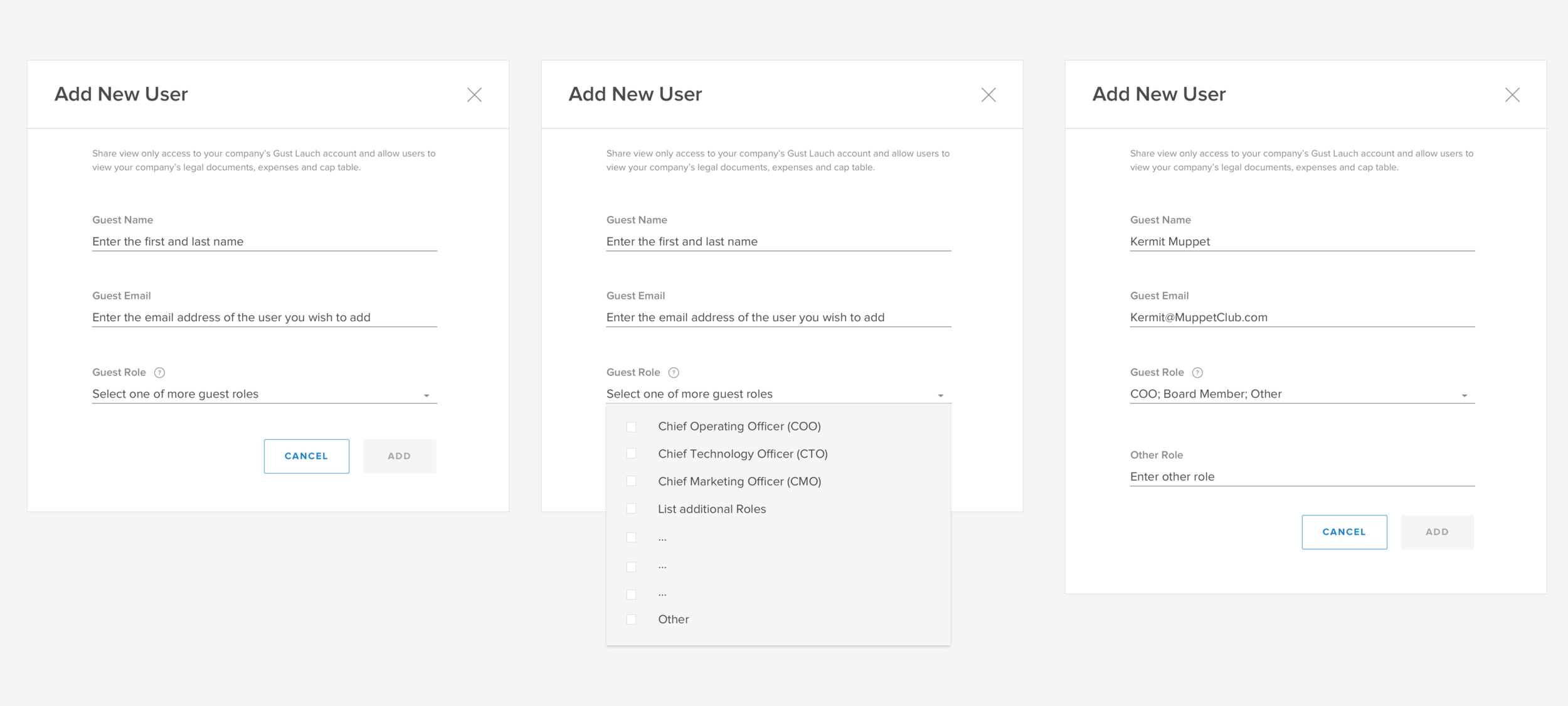
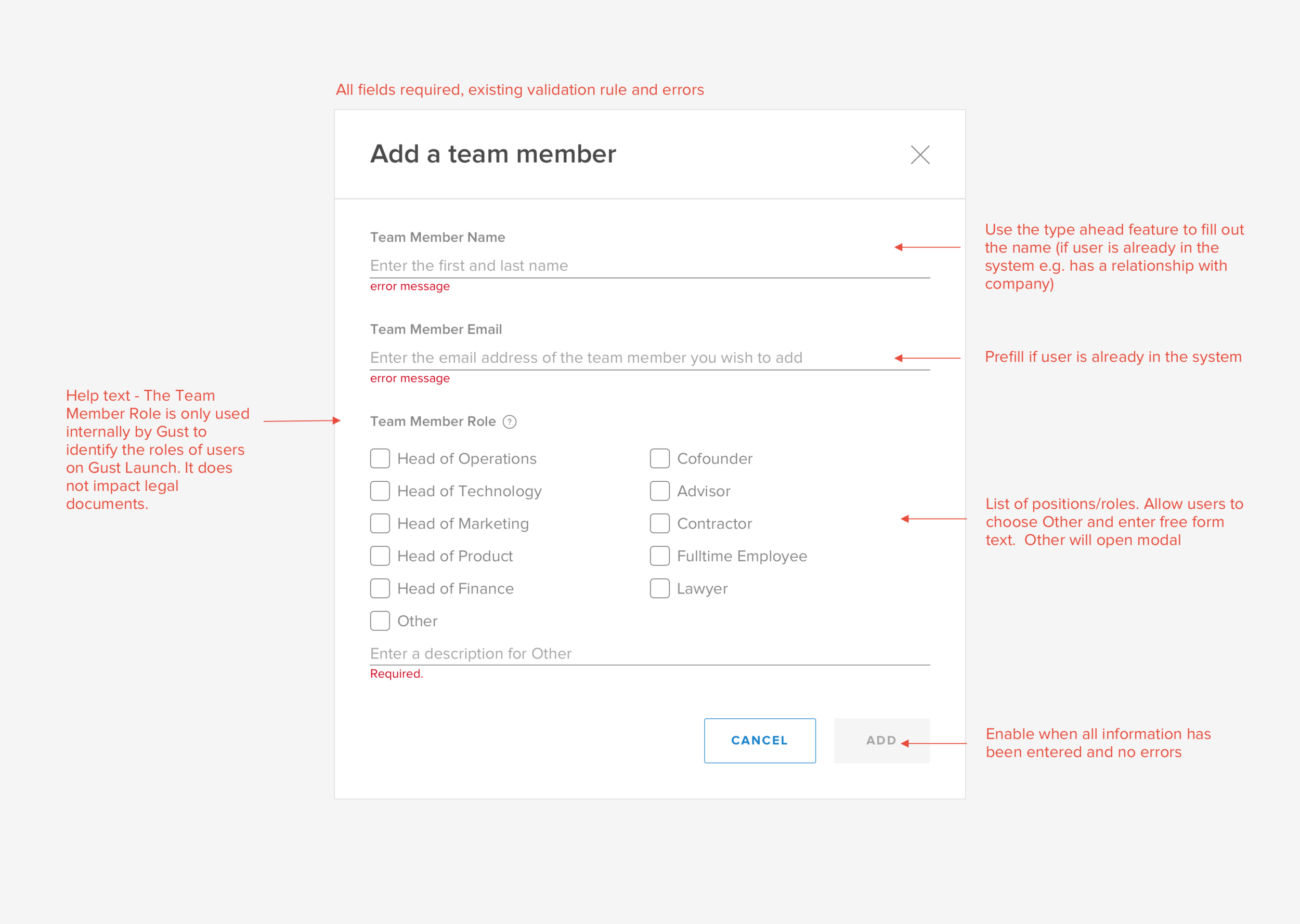
Since we needed to capture the role of the team member, I put in some thought around the language of the invite modal. We initially used ‘Guest’ to refer to the invited party, but upon further reflection, we decided to change it to ‘Team Member’, because, from the CEO’s perspective, this is who they’re actually inviting to their Gust Launch account.
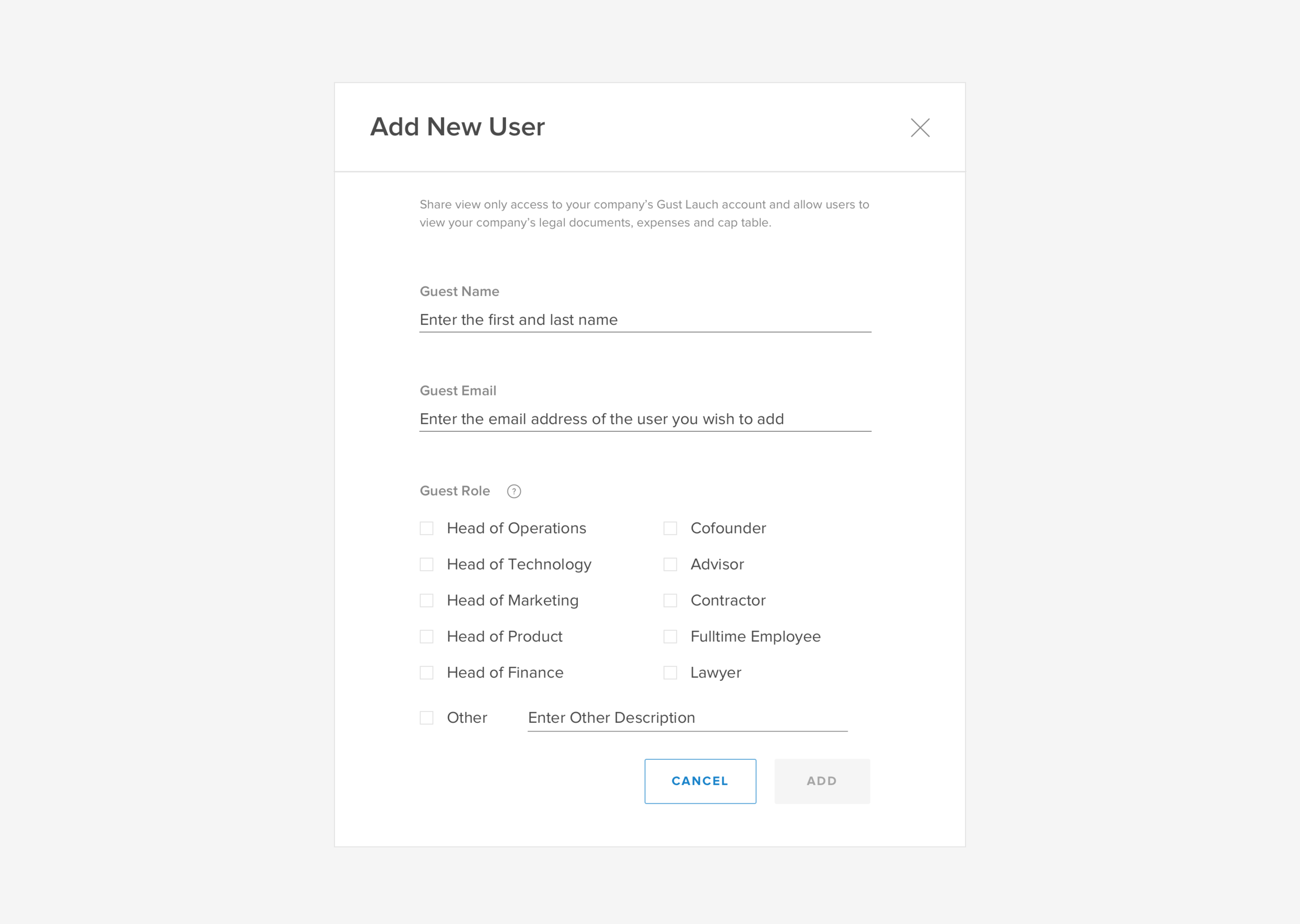
In addition to modifying the language of the initial design, I also simplified the interaction. Initially, the list of roles were hidden behind a drop down list. However, it was not obvious that the user could select multiple roles, so I changed the form to display all the check boxes straight away. This minor change made it much more obvious that you could select more than one role.
While developing the new form, an issue came up around the type head feature and email look up in the name field. Apparently that functionality was tied to an existing component with hard coded styles. The developer quickly put together the form for me with the existing component which didn’t look perfect but we negotiated along with the project manager that we can update the styling in a future iteration.
deliver
By utilizing our existing style guide and design patterns, I was able to create the new components we needed and cohesively piece together the entire experience. Because we had an established living style guide, all I needed to communicate the details of each component were simple wireframes.
Given the time constraints and the fact that we were not designing any new interaction patterns, I was ok forgoing our typical usability testing process.
WHAT we released


WE also solved for…
Different user types
We also had to develop a way to show each team member their version of the dashboard. Our original dashboard was built solely for one user type, CEOs, and all the information was organized and written with only this type of user in mind.
The goal was to display the correct status and action required (or FYI), for a particular legal process, based on the audience that’s viewing it.
HOW?
The dashboard is split into three different sections, each representing a high level state of a legal process from the perspective of the CEO:
To Do’s: Legal processes that need to be started
Awaiting Others: Legal process that are awaiting other parties to sign
Completed: Legal processes that have been completed
Current CEO Dashboard with three different sections
In order to organize the information in a clear and informative way for the appropriate audience, I had to first come up with a way to consolidate and then categorize the different roles (that are a party to a legal process) based on how they would act upon the information presented.
I collaborated with one of the developers to define three main user categories based on user actions:
The initiator: someone that initiates a legal workflow (currently only the CEO)
The counterparty: someone who needs to sign a legal workflow (depending on the workflow, it could be the CEO, a board member, someone receiving a stock grant and their spouse)
The observer: a team member who does not need to sign any legal workflows, but can view them and their progress
Next we needed to think through the type of information the three user types would need in various states of a particular legal process and whether that information was clear and informative. Simply extending the dashboard details as it stood would not make sense contextually for the counterparty or observer.
The example below shows a stock grant that is ready to be issued by the CEO in the “To Do” section of the dashboard. On the counterparty’s end, they will see that the stock grant is in the Awaiting Others section. However, the description only tells the counterparty that the grant has been approved by the board and “3 of 3” is complete (indicating that all signatures have been collected) where as it should really be informing the counterparty that the Stock grant is ready for the CEO to issue.
The CEO dashboard on the left and the Counterparty dashboard on the right.
To address the inaccurate information presented to counterparty and observers, I audited all of the workflows and their states. This helped me determine where we needed to change the information that was displayed so that it would make sense to the counterparty and observer user.
Audit of the Stock Grant workflow with all its states and information from different user’s perspective.
What we’ve learned so far…
The experiment has been running for a few weeks and while we haven’t been able to attribute upgrades to co-founder access yet, we’ve learned a number of things:
As expected, CEO’s are inviting the founding team to the platform.
Two days after incorporation may not be the best time to promote this feature. Users have indicated from a survey that they don’t have a need for the feature right now, but will likely need it in the future.
Team members are generally looking at completed legal documents.
Lawyers are being invited to the platform - we might consider optimizing the connect with a lawyer feature.
We are continuously monitoring what the users are doing on the platform via analytics and reaching out for feedback via surveys and user interviews. So far, the jury is still out on whether this experience will influence upgrades. In hindsight, it may have been too ambitious to determine that based on this MVP experience and we could have come up with metrics that were move relevant to this feature.


